Gin Due Due
Category
food and beverageCustomer
Gin Due DueDate
2023Location
San MarinoWhere Cultures Meet in a Bottle
For Gin Mate by Gin DueDue, I led the art direction and design to capture the meeting point between Italian craftsmanship and South American vitality. My work spanned from the label design to the digital presence, ensuring a seamless visual dialogue between the physical and online experience. The challenge was to translate the gin’s dual soul —juniper and yerba mate, tradition and energy— into a clean, contemporary identity that feels both natural and sophisticated.
- Branding
- Packaging
- Web Design
- Illustrations
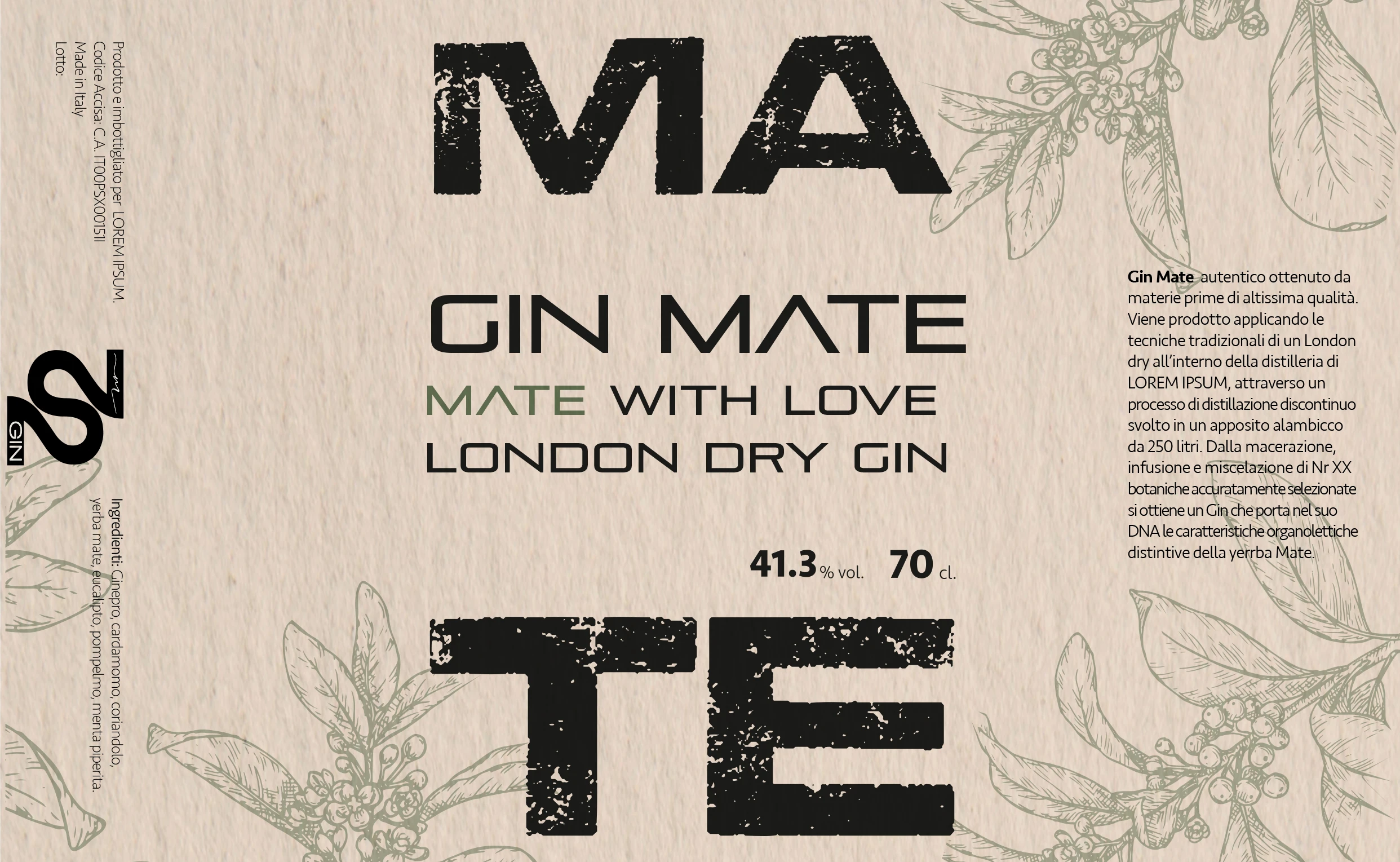
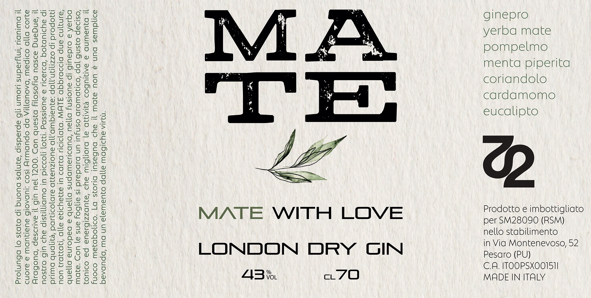
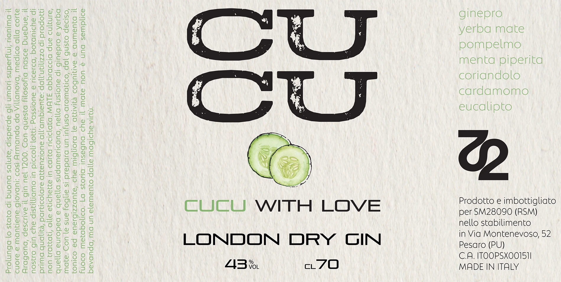
The label design was conceived to embody the dual cultural identity at the heart of the brand: Europe meets South America, juniper meets yerba mate. The label features a clean, modern layout with botanical illustration elements and crisp typography, printed on textured recycled paper to evoke naturalness, authenticity, and environmental care. The restrained color palette nods to both heritage and freshness —subtle earth tones punctuated by a vibrant accent that suggests the energizing character of yerba mate.
Web Design
On the website, the design mirrors this same philosophy of balance and storytelling. The layout is minimal and modular, using generous white space, clear typographic hierarchy, and carefully chosen imagery to guide the visitor through the narrative of botanicals, flavor, and identity. Visual continuity is maintained via the same botanical motifs and color accents from the label, ensuring that the digital experience feels like an extension of the physical product. Interactivity is kept intuitive and light —subtle hover effects and transitions enhance rather than distract, supporting a clean, immersive presentation that places the gin (and its story) front and center.